I did research on colour psychology for my colour scheme. Red is used to stimulate the body and mind and to increase blood circulation. Yellow is thought to stimulate the nerves and provoke body purification. Orange is used to heal the lungs and is thought to increase energy levels. Blue is believed to soothe illnesses and treat pain. I then did further research on blue. It turns out that people often describe blue as the colour of stability and safety. This is the idea that I wanted to portray through my website. As a portfolio website, I want potential employers to have a sense of stability and trust when they view my website. It was decided to use #00ccff as my shade of blue. This specific shade was chosen because it is a light blue that is aesthetically pleasing and not ‘harsh’ to look at.
Background Images:
The images used in my background were chosen for two reasons. The first reason was to portray a passion for digital design. The images are of laptop screens with code on them. The simple use of these images changed the entire look of the website. The images tied together the idea of my passion for the digital era and digital design. The second reason that they were chosen was to unify the colour scheme and with the background. This can be seen because the images have cool colours such as blue and some purple. This fused well with my chosen colour scheme. It is also important to note that all the images chosen are copyright free and were downloaded on Unsplash.com.
UI and Navigation:
The user-interface of the website was designed to be interactive as well as aesthetically pleasing. When a user hovers over certain elements it gives them visual clues that they can interact with these elements. For example the navigation bar on the left side has hyperlinks that can be clicked on. When the user hovers over a heading, the heading increases in size and turns from white to blue. This indicates that they can be clicked. Once clicked the page will scroll to the selected heading. This navigation was implemented because it gives the user more control and makes the website easier to use. Other elements such as the hire me button also increase in size when a user hovers over it. I also implemented a colour scroll interface for my blogs. It can be seen that when the user hovers over a blog abstract, the entire card box of that blog turns blue. This makes it easier to read the abstract and also indicates to the user that the box can be clicked to open up the full blog. A different technique was implemented for the portfolio section. In this section, when the user hovers over a project image, the image changes in size and also displays a heading for the project. All of these elements were added to create a smooth and aesthetically pleasing experience that is easy for the user to interact with. Furthermore, I used the Roboto text from Google Fonts because I found it to be aesthetically pleasing and professional.
Technical Reflection:
I believe that my website displays a fair amount of understanding the technical requirements for the course. For example, in my blog posts, I make use of many semantic tags. These include <strong> instead of <bold>, <em> instead of <i> and so on. I also used the <article> tag instead of the <p> tag for my blogs and reflections. The use of these tags creates more meaning for web crawlers to find my website. The content becomes clearer to these crawlers and ultimately helps users find my website. Furthermore, I did make use of the alternate texts for images which make the website more accessible for users using screen readers. I also made use of a few metatags to have a clear link between all the data. My navigation bar fits well on a 100% (or bigger) screen, but I also implemented responsiveness. I implemented the responsive aspect using various limits on the screen width. When the user zooms in, the navigation bar will disappear and a bar icon with 3 lines will be displayed in the top right-hand corner. This saves screen space and also allows the user to use the navigation bar by clicking the top right icon. When the user zooms out, the navigation bar will reappear, and the bar icon will disappear. Furthermore, my hyperlink headings, buttons, and page links all work flawlessly. I have not implemented JavaScript yet because it was not a requirement for this submission.
Creative Reflection:
I think it is fair to conclude that my website displays good use of CSS. For example, on my home section, I implemented the words “DIGITAL DESIGN” using a colour sliding effect. This was done to further emphasis the fact that I am passionate about digital design. My colour scheme is aesthetically pleasing and consistent throughout the various pages. My use of CSS created a pleasing experience for users that have tested my website. The colour changes and scale adjustments when hovering over interactable features gives the user clarity on what they can and cannot interact with. I am happy with my aesthetics for the first submission, but I do predict further improvements for the second. This will be achieved by combining JavaScript and CSS.
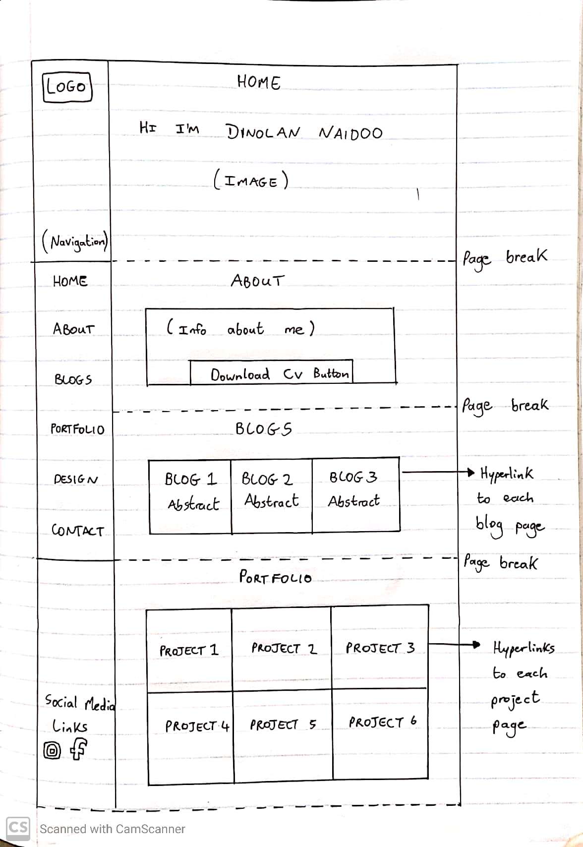
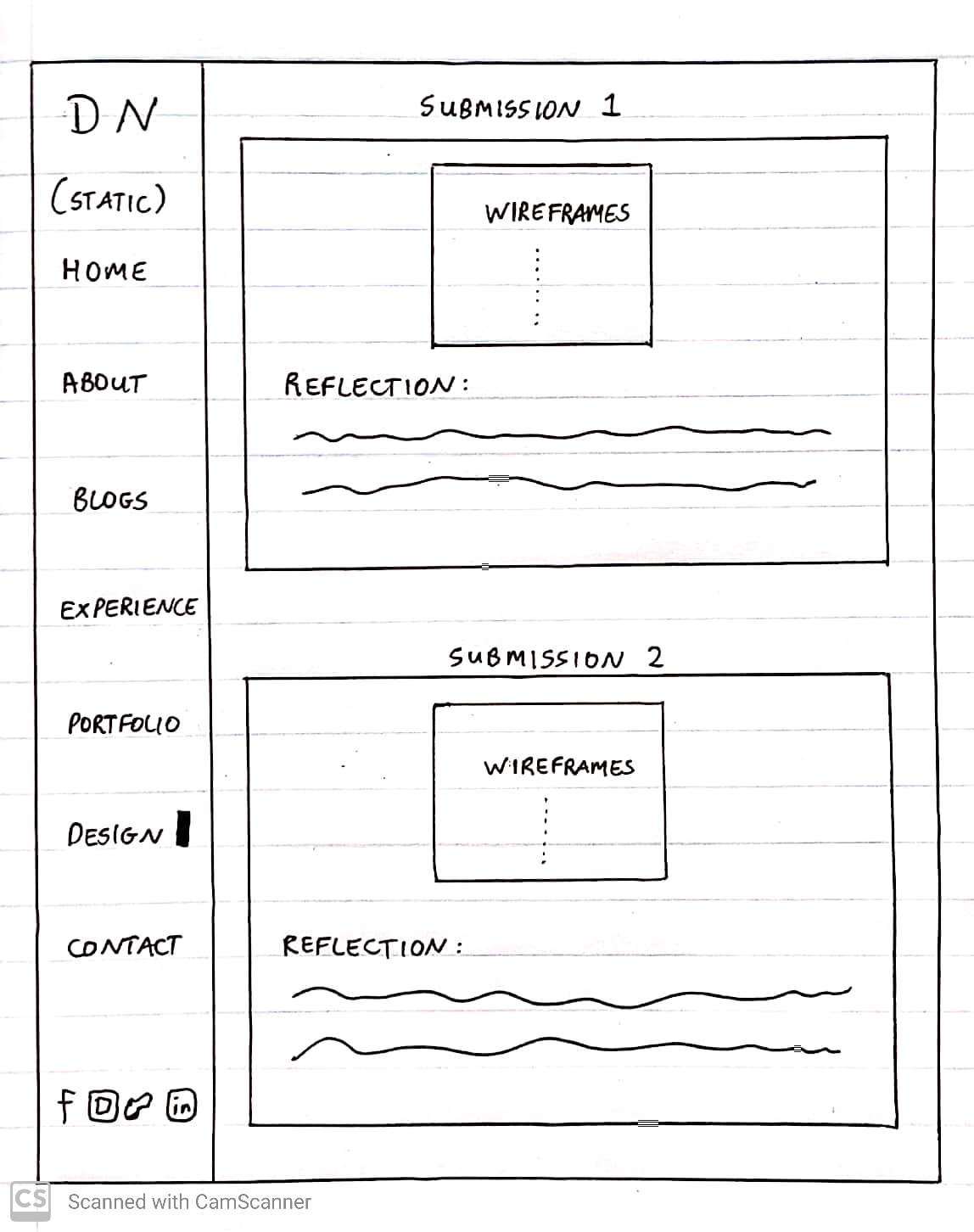
Submission 2: Wireframe Design
Design and Reflections:
Home Section:
As seen in the screenshot above, the home section remained the same from the previous submission. The only changes made to this section was the responsiveness. The font- size decreases as the screen width decreases. Furthermore, in extreme cases (tiny screen width), I took out the statement I am passionate about digital design. This saves room for my name which is the main content that I want to display on the home section. The shade of blue used is consistent throughout the home section. This shade of blue was chosen to match the colours in the background image. Further reasons for selecting blue can be found in my first reflection. Lastly, I added an indication on the side bar to tell the user which section they are currently viewing (seen in the navigation bar). This was done to give the user clarification on section navigation [1]. Furthermore, the indication bar matches the colour scheme which unifies the user-experience.
About Section:
The first noticeable change is the background image. In order to optimize the performance of my website, I decided to use a single static background image for the entire page instead of having different images for each section. Furthermore, I used TinyJpeg.com[2] to reduce the size of the background image. I also optimized all my other images using the same software. The combination of these two changes optimized my website loading time. The second change is the Download CV button. When the user clicks this button, my CV opens up immediately in a new tab. This decision was made so that the user can view my CV without having to download it first. In my opinion this creates a streamlined user-experience because it reduces any downloading delays.
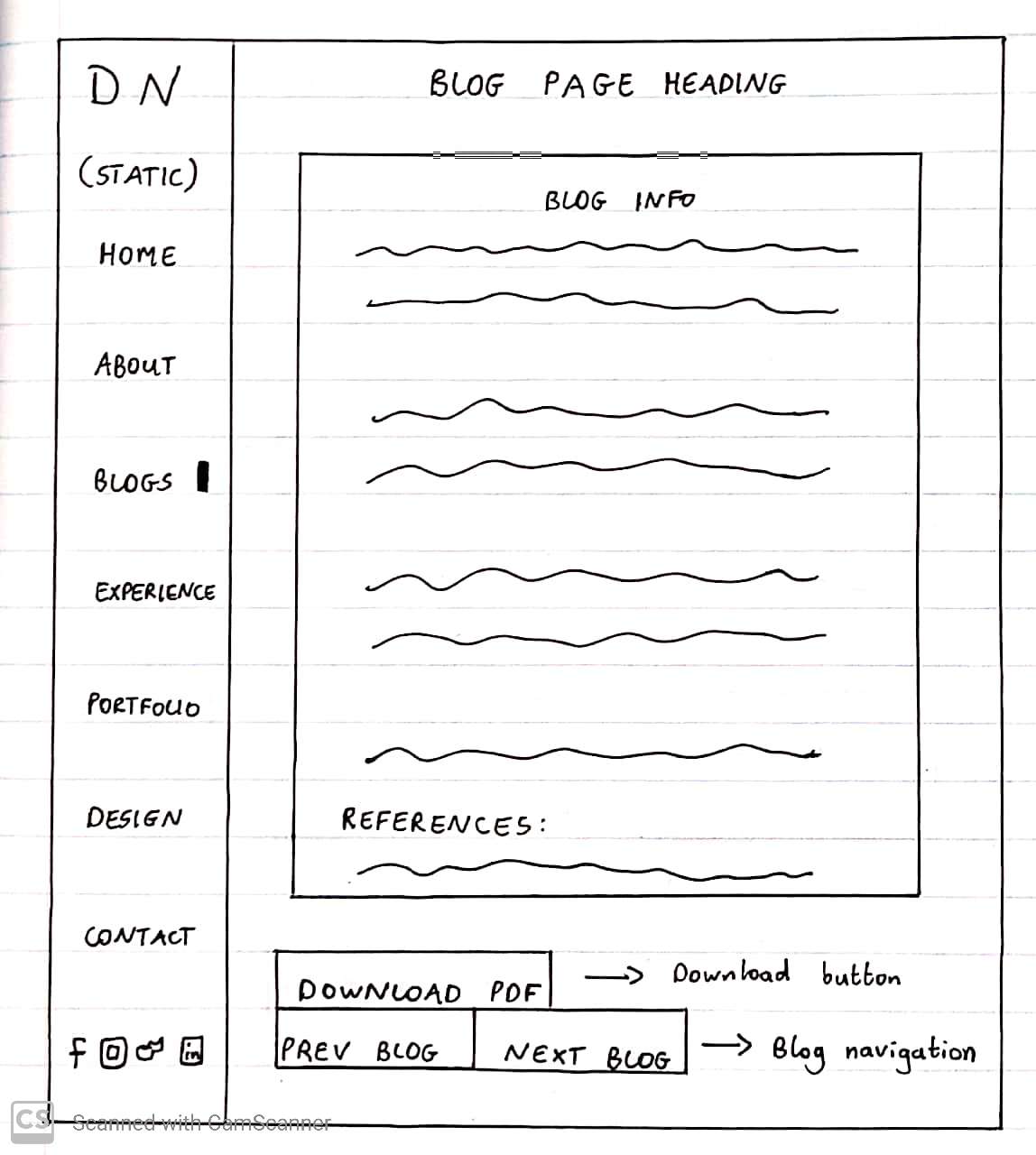
Blog Section:
The blog section does not have many changes. The first change was a technical change. Instead of using the < br > tags for spacing , I used CSS padding. As seen in the screenshot above, the side-bar navigation shows the user that they are on the blog section. It can also be seen that the user is hovering over the blog 1 abstract. The background of the blog text box changes to blue. This blue is the same shade of blue that is used throughout the website. Once again this unifies the colour scheme and gives the user a consistent user-experience. The other changes occur within the actual blog pages. The side-bar navigation remains in place even when the user clicks to view a blog. This gives the user an option to navigate to any desired section of the website. The last addition that was added within the blog pages was the ‘Previous Blog’ and ‘Next Blog’ buttons. This streamlined the user-experience because the user did not need to traverse between the blog abstracts and the blog pages to see the previous or next blog. Lastly, when the user hovers over these buttons, they turn blue to unify the colour scheme further.
Experience Section:
The first change in the experience section was populating the text with my relevant experience. It is not complete yet, but the rest will be done for the exam submission. I then added a border around each block of text. This was done to separate the information visually which made it easier to read. Furthermore, the border colour matches the shade of blue used throughout the website. This further unifies the colour scheme. I also fixed the responsiveness for this section. The font-size decreases as the screen width decreases. The horizontal bars indicating my coding experience also decreases in width. This results in an experience section that is responsive to any screen size.
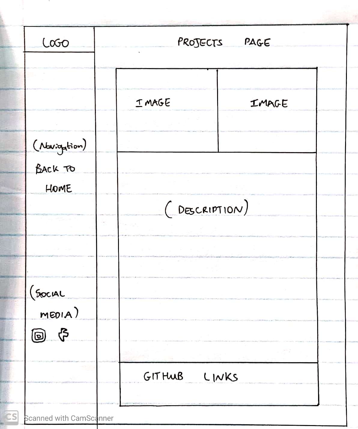
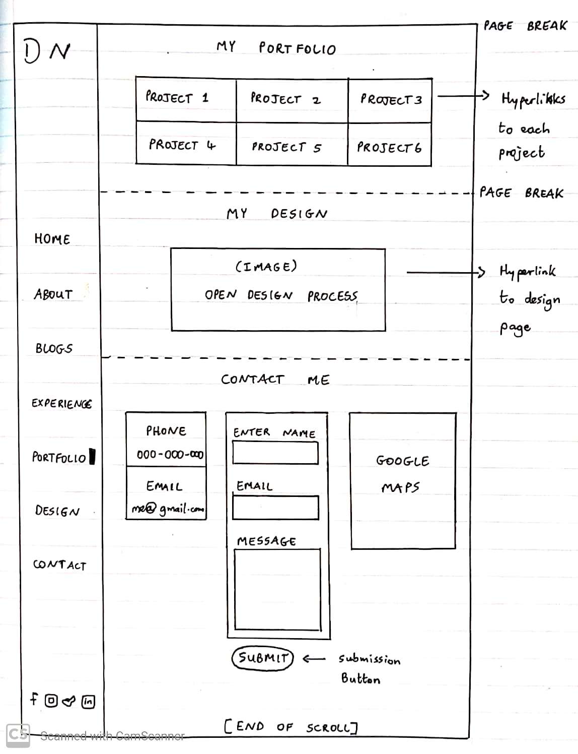
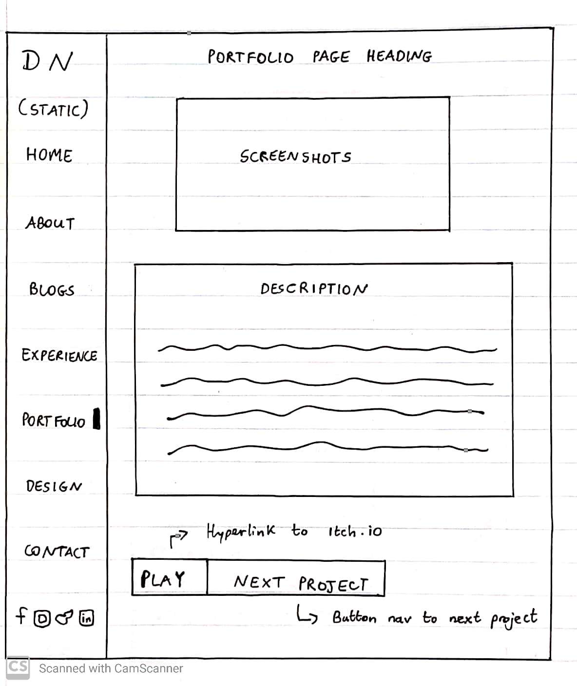
Portfolio Section:
The first change to the portfolio section was the abstract layout. It was decided to use a consistent layout that matches the blog section abstracts. This was done be replicating the colour slide effect from the blog section. As seen in the screenshot above, the user is hovering over portfolio abstract 1. The background is highlighted in blue to allow for easy reading and to indicate that the abstract can be clicked. The next addition was populating the portfolio section with my unity projects. I completed 5 out of the 6 portfolio projects. There will be further additions and more elaborate descriptions in the exam submission. Once the user clicks a portfolio abstract , the website navigates to the portfolio page. The portfolio page consists of a screenshot of gameplay and a description under it. Furthermore, JavaScript was used to create a particle effect background for the portfolio pages. This effect further illustrates my passion for digital design which is why it was included. The particles are also the same shade of blue used in the entire website. This further unifies this user-experience. I then uploaded my games to itch.io[3] and provided a ‘Play Game’ button. When the user clicks this button, they get directed to my game on the itch.io website. I also added a ‘Next Project’ button to make the navigation to the next project easier for the user. The styling of these buttons are exactly the same as in the blog pages. This creates a unified user-experience and meets the expectations built up by the user.
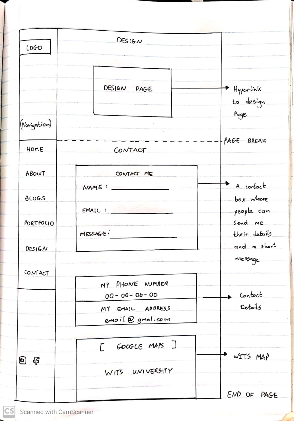
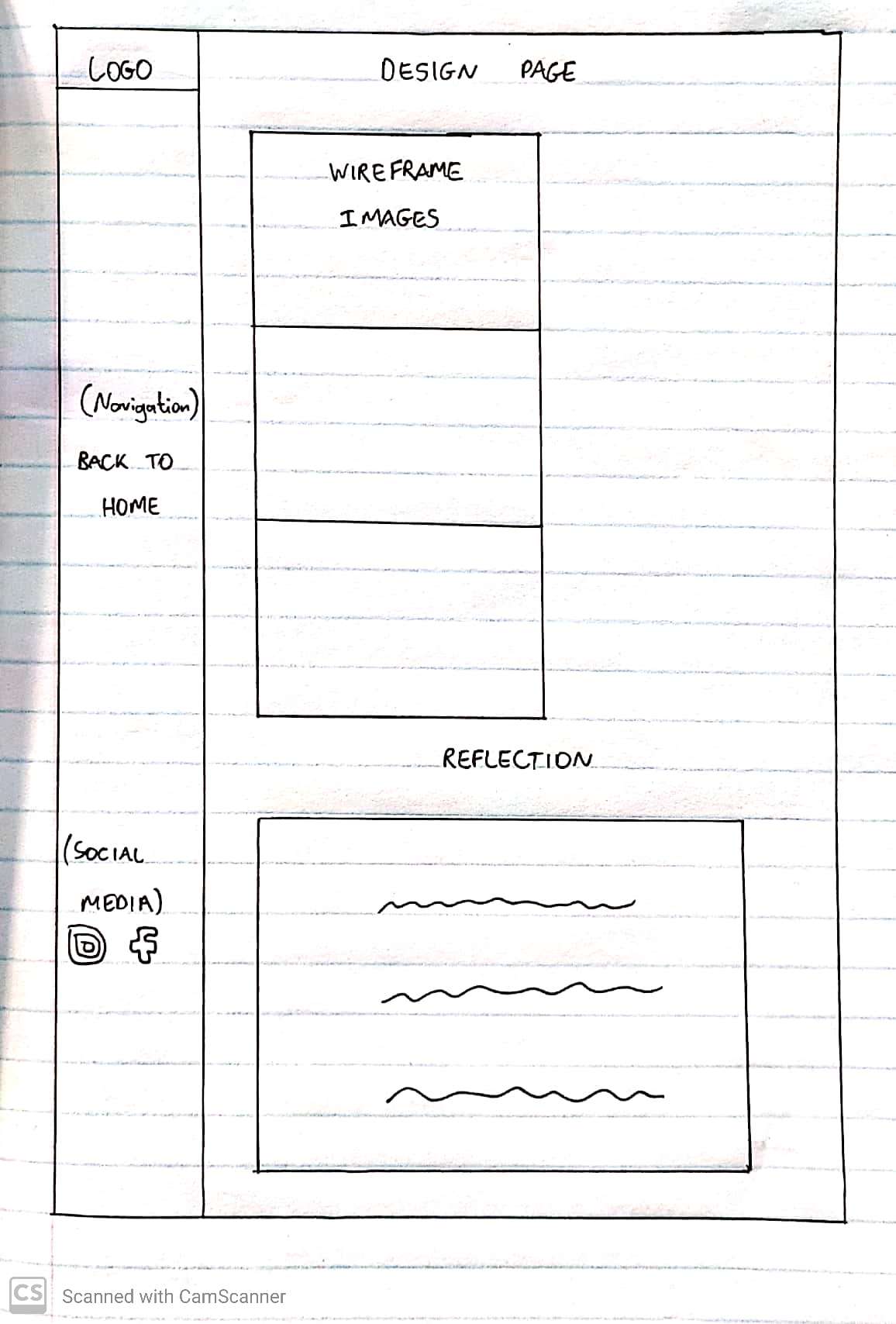
Design Section:
The design section responsiveness was an issue in the first submission. As a result I fixed these issues by reducing the font sizes and flex direction of the container. Furthermore, I reduced the size of the design page hyperlink image. This optimized the loading time of my website. I also removed the background image within my design page. This was done due to a slow loading time. I needed to have my wireframe images and style guide screenshots all on the same page so the best solution for the second submission was to remove the background image. In order to keep the unified feel to the page, I added a blue background. I also added the static navigation bar which remains consistent throughout my website. Other than responsiveness, the navigation bar and optimization, the design section remained the same with the exception of my second submission reflection.
Contact Section:
The contact section remained relatively the same for the second submission. The only change was fixing the responsiveness. This was done by implementing a flex display and changing the flex direction to column in CSS.
Technical Refelection:
My second submission includes improvements in semantic markup. For example I used the <cite> tags for my references, the <article> tags for my blogs and I made better use of ranking my headings with the <h> tags. It is important to note that I did not edit my first 3 blogs. This will be edited for the final exam submission. I also added some microformats. For example I used rel=”author” in my blog posts to indicate that I am the author. In terms of JavaScript there can be certain improvements. I added the aesthetic on the navigation bar (to indicate which section is active) using JavaScript. I also implemented the background for the portfolio pages using JavaScript. These scripts will need to be optimized further for the exam submission. Further JavaScript will be implemented for navigation purpose.
Reflection References:
1) Balanco, D., n.d. Importance Of Website Navigation. [online] Optimus01. Available at: https://www.optimus01.co.za/importance-of-website-navigation
2) Tinyjpg.com. n.d. TinyJPG – Compress WebP, PNG and JPEG images intelligently. [online] Available at: https://tinyjpg.com/
3) itch.io. n.d. Download the latest indie games. [online] Available at: https://itch.io/

.jpg)
.jpg)
.jpg)
.jpg)
.jpg)
.jpg)
.jpg)